Alyssa Leong ‘23
Design Editor
Located in every residential hall, Scripps’ browsing rooms are part of the campus’ history and an essential portion of the school’s tour. These study rooms are part of what makes Scripps so unique, with photos documenting their legacy and word-of-mouth documenting the tales of the hauntings that (allegedly) took place in their hallowed halls. But more importantly – history aside, what exactly are the vibes of each browsing room? On a sunny (and sweaty) afternoon, I explored every residence hall’s browsing room to answer that very question. As follows, here is the definitive ranking of every single browsing room Scripps College has to offer.
8. Kimberly/ Wilbur
Ok, I know this is technically a browsing room ranking (and not a residence hall one), but it’s crucial that I set the scene with my Kimbo/ Wilbur experience to explain why I ranked it last. Having only been to the Wilbur kitchen, I didn’t know what to expect when entering the hall from the back door facing Tiernan. Although it was a sunny November day (side note: Southern California and climate change work in weird, weird ways), upon entering Kimberly, the interior was almost completely dark save for fluorescent hall lights. Empty halls stretched before my eyes. A deep silence permeated the building, and there was an eerie lack of other students in the hall. Time seemed to fade away as I circled the building, trying to locate the browsing room and get out as soon as possible. While the entire hall felt like an old rec center or hotel, I was still taken aback to find the browsing room itself had all the charm of an unused hotel library. The furniture was inexplicably purple, the art deco mirror and fireplace felt too grand and yet not grand enough, the bookshelves scant, the painting of Kimberly herself seemed to be staring into my soul. But the worst factor was the lighting. Unlike any of the other browsing rooms, the windows have a tint placed over them, making the room feel dark and uninviting. The yellowish fluorescent lights only make the room feel even more inhospitable. Everyone talks about how the Toll or Browning or Clark browsing rooms are haunted, but the Kimbo/ Wilbur one has an even more omnipresent vibe. “Someone has died in here,” I wrote in my notes as I hurried out. With its darkened, silent atmosphere, the Kimbo/ Wilbur browsing room feels like a liminal space, similar to a gas station at night or an abandoned mall – a place where time doesn’t seem to exist and where dreams go to die.
7. Dorsey
Dorsey’s browsing room was quite the upgrade from Kimbo/ Wilbur (although that is an admittedly low bar). Upon entering the “library,” as it’s labelled, the room felt fairly small and unused. The vibrancy of the carpet gives the impression of being un-intruded on (although perhaps this is due to Scripps’ excellent janitorial staff), the ceiling is low, and the fireplace oddly enough has the shape and appearance of a pizza oven. But for the most part, the Dorsey browsing room is cozy and clean. It’s tidy and doesn’t have any odd odors, plus it has a window overlooking the Browning/ Dorsey courtyard and the rose garden. Plus, it has a decent selection of science and econ textbooks (unfortunately alongside some outdated/ unnecessary college prep books as well). Definitely a cozy study space for a small group of friends, but probably not many more than that.
6. NEW
NEW hall’s abundance of courtyards, balconies, and overall NEW-ness always takes me aback, so I had high hopes for the browsing room – high hopes that were unfortunately dashed. It has a nice view of Tiernan, complete with large windows that keep the room feeling bright and airy. There are also some interesting paintings that match those of the GJW browsing room (see below). While it’s a good study space and I could get work done, it’s unfortunately nothing special.
5. GJW
Much like NEW hall, GJW’s browsing room is somewhat disappointing considering the residence hall surrounding it. I rank this slightly higher than NEW solely because of the decorative windows, but other than that there is little to distinguish the two browsing rooms.
4. Routt/ Frankel
Considering the unappealing nature of Routt and Frankel themselves (thanks Mudd!), their browsing rooms (while identical) are… fairly decent. Despite their lack of character, their interiors are clean and simple (without feeling ugly), and large windows keep them light and airy with natural lighting. The furniture seems clean enough, and the long table makes it so that multiple people can study there at once. Their proximities to each of the hall’s laundry rooms also make them convenient places to study whilst waiting for laundry. Plus, the Routt browsing room in particular has some interesting books (including this absolute monster of a dictionary), which warms my inner bookworm heart.
3. Clark
Ok, I’ll have to admit my bias on this one. On looks alone, Clark should definitely go between Dorsey and NEW – its plain looks and questionable couch are nothing special. But as a first-year Clark resident, I spent many an hour studying, chatting, and watching Netflix here with my friends – experiences definitely made rosier through the lenses of post-Zoom university. Even still, Clark definitely has some overlooked features. Take the aesthetic appeal of the color-coded books, or the balcony overlooking the tree-lined steps into Clark, or the proximity to the printer. The Clark browsing room, while unassuming, is a place where you can get work done (and look at some rainbow bookshelves while you’re at it!).
2. Browning
Definitely an underrated gem in Scripps browsing rooms! With its large windows overlooking courtyard views, paintings, ornamental fireplace, and patterned decor, Browning’s browsing room feels like Toll’s sister. Although it’s considerably smaller, it makes for an even more cozy and approachable feeling. A small, bright, clean browsing room with all the signature Scripps panache!
1. Toll
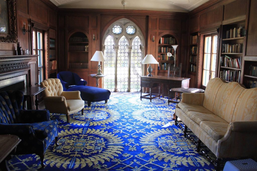
Who would I be if I didn’t put Toll first on this list? Scripps’ oldest browsing room is a certified classic with the perfect Hogwarts common room feeling that everyone looks for in a liberal arts college. Although it’s a quite space (sorry, no collaborative studying here), it checks out with the room’s regal feeling. This browsing room has everything: bright natural lighting and a lovely view courtesy of the Gothic windows, a commanding wood-paneled interior, sofas and chaises are plush and easy to sink into (ESPECIALLY the blue one), a beautiful carpet, a painting of Toll herself that actually doesn’t look terrifying, and a book selection with some wacky titles on the shelves (such as Poems in Praise of Practically Nothing – highly recommend the one about the ostrich). A classic Scripps spot complete with a view of the greenery and a haunted past!
Image Source: Scripps College


